The Responsible Trader’s Analytical Framework – Reading Ichi Moku Charts like A-B-C – Part 1
The Responsible Trader’s Analytical Framework – Reading Ichi Moku Charts like A-B-C – Part 1
While I was preparing my Powerpoint Presentation for my TRT-POV on Module 10 – Cloud Charts and the Ichi Moku Technique last year, I discovered a method to make reading Ichi Moku Kinko Hyo Charts as easy as A-B-C. During that time, I decided not to push through with my TRT POV on Ichi Moku because I wanted to test my discovery if it really works.
Several backtests and application in my actual trading produced very good results. This convinced me in my decision to include it as one of the Chapters (Chapter 2) of my book “The Responsible Trader – a Thinking Person’s Guide for Trading the Philippine Stock Market.” Oops, but that is putting the cart before the horse. Let me first tell you how it all started.
My Struggle with the Ichi Moku Charts
Like many of you, I was also mesmerized and perplexed by the Ichi Moku Kinko Hyo Charts with its several lines and clouds with alternating colors. I started reading all the materials I could get my hands on, watched Youtube videos and studied charts shared by many in Facebook and trading groups. No matter how I tried I could not seem to get the head or tails of the technique.
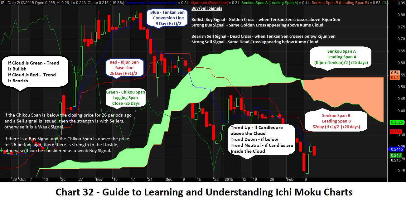
Whenever I am faced with a lot of information, I usually put everything in writing to make sense of what they are telling me. The Chart below is my first attempt in doing this. Later on I called this the Guide for Understanding and Learning Ichi Moku Charts and made it Chart 32 of my book.
Inspiration from a passing Airplane
While I was deep in my study, an airplane passed by with a loud noise and disturbed my concentration. The sound was so loud I had to get out of my room to take a view. Suddenly, some ideas dawned on me. The candles representing price action is like that airplane. Above the clouds, it flies unhampered in blue skies. Below it is subject to a lot of visibility problems. All of a sudden, everything started to make sense and fall into place so I pulled out a Spreadsheet and tried to put everything together into an Analytical Framework.
The Meaning of the Terms
In reality, Ichi Moku Charts are just application of candlesticks and moving averages and moving average envelopes.
Let us try to understand the Japanese terms one by one to get the whole meaning.
Ichi – means one. (Do you still remember the movies or TV shows where you see Japanese soldiers marching or exercising and the commander shouting repeatedly Ichi, Ni, San, Si, or 1,2,3,4,?)
Moku – means View or Glance
Kinko – means Equilibrium or Balance
Hyo – means Chart
Translated in English Ichi Moku Kinko Hyo means One Glance Balance Chart or One Glance Cloud Chart.
The above term is self-explanatory because once you understand this method, it will enable you to understand the exact state of the market “at a glance” by just looking at only one chart.
Origin and Development of the Chart
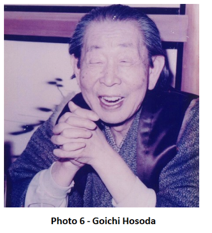
The Chart was developed by a Japanese reporter, Goichi Hosoda, in the early Showa era (1926 to 1989). Goichi Hosoda used the pseudonym “Ichimoku Sanjin” where the first Chinese character of his name means “at a glance”.
The technique was not widely adapted in Japan because the computations required to produce the chart were tedious and time-consuming. Recently because of the advent of computers which facilitated faster computations, the system was revived by Hidenobu Sasaki of Nikko Citigroup Securities who published Ichi Moku Kinko Hyo chart studies in 1996. Since then Ichi Moku Kinko Hyo has become a permanent feature in Japanese trading rooms in addition to other Japanese charting methods.
The Ichi Moku chart consists of Candlesticks and Five Lines. Ichi Moku Charts are different from Western charts in the sense that these are drawn using midpoint prices instead of closing prices. The calculation of these five lines involve taking the average of the High and Low price of the day and dividing these by two. The midpoint price calculation is not adjusted for volume. The chart when completed is able to present a clear perspective into the price action of the stock at hand and provides good guidance for making trading decisions.
Five Lines of the Ichi Moku Chart
The Ichi Moku Chart is composed of Five Lines
1. Kijun Sen – Base Line or Standard Line
2. Tenkan Sen – Conversion Line or Turning Line
3. Senkou Span A or Leading Span A
4. Senkou Span B or Leading Span B
5. Chikou Span
Let us take a look at these lines more closely.
The first two lines, Kijun-sen and Tenkan-sen, are used to generate Buy and Sell Signals and also serve as variable Support and Resistance as what we have learned when we discussed Moving Averages. Let us study these two lines first.
- Kijun Sen – Base Line or Standard Line. Is a calculation of the Highest High + Lowest Low/2 over 26 periods. In Japan, where the method originated, since they work from Monday to Saturday, six days a week, the average number of working days is 26. This explains why they use 26 as the standard moving average in the computation.
The Kijun Sen is similar to the Signal Line in the MACD (Moving Average Convergence Divergence) which also uses 26 days in the computation.
- Tenkan Sen – Conversion Line or Turning Line. Same calculation as the Kijun Sen or Baseline, Highest High + Lowest Low/2, but over 9 periods these are plotted on a chart like a moving average. By trial and error and through back-testing, it was determined that 9 periods work best under this setup.
You may recall that the MACD (Moving Average Convergence Divergence) also uses the 9 and 26 period combination.
Similar to the MACD, Buy and Sell signals are generated when these two lines cross over. A Buy Signal is generated when the Tenkan-sen makes a Golden Cross or crosses above the Kijjun-sen. A Sell Signal is generated when the Tenkan-sen makes a Death Cross or crosses below the Kijun-Sen.
For easy recall just remember double “T“ (Tenkan-sen – Turning Line) is the one that gives the Buy or Sell Signal. The Turning Line is responsible for turning the fortunes in your favor.
The two lines also serve as variable Support and Resistance. In an uptrend The Tenkan-sen usually serves as first line of Support limiting the pullback. The Kijun-sen serves as the second line of Support which is very critical. If the pullback breaks down below the Kijun-sen, then it is considered a potential sign of a reversal in trend.
In a downtrend, the reverse holds true. This time the two lines serve as Resistance. The Tenkan-sen serves as first line of Resistance and the Kijun-sen serves as a second line of Resistance which is very critical. If the price breaks through the Kijun-sen, then it considered a potential sign of a reversal in trend.
The slope of the Kijun-sen is very important. The more steep the slope in an uptrend or downtrend, the more powerful the current trend and the more likely it is to continue. An angle of 33% to 45% is considered strong and sustainable.
The next two lines, the Senkou Span A and the Senkou Span B are the ones used to form the Kumo or Cloud.
- Senkou Span A or Leading Span A. Serves as the first line of the Cloud. It is calculated by adding the Tenkan-sen (9-day average) and Kijun-sen (26 day average) and dividing by two. The result arrived at is plotted with a line 26 days ahead of the last completed days of trading
- Senkou Span B or Leading Span B. Serves as the second line of the Cloud. It is calculated by finding the Highest price of the last 52 days, adding to it the Lowest price of the last 52 days, and dividing by two. This is also plotted 26 days ahead.
The space created between these two lines, The Senkou Span A and Senkou Span B, is called the Kumo or the Cloud.
The Cloud also serves as indicators whether the Trend is Bullish or Bearish. If the Cloud is Green, the trend is Bullish. If Red or sometimes Orange, the trend is Bearish. If the candles are inside the cloud, the trend is Sideways or Neutral.
The last line in the Ichi Moku Kinkyo Hyo Chart is the Chikou Span
- Chikou Span – Lagging Span or Delayed Line. Is the closing price 26 periods behind the last daily close of the current period.
To be continued – The Responsible Trader’s Analytical Framework – Reading Ichi Moku Charts like A-B-C – Part 2